Understanding the Principles of Responsive Web Design
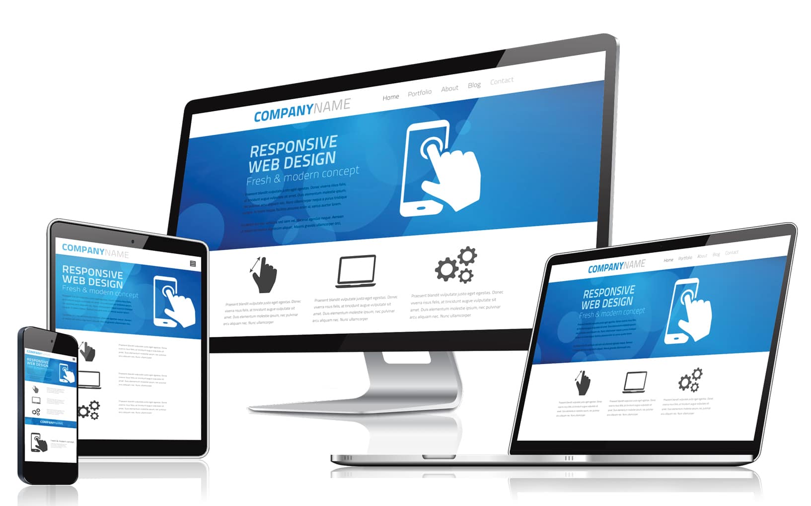
Responsive Web Design is an approach that allows web pages to render well on a variety of devices and window or screen sizes. The primary aim is to ensure that content is easily accessible and visually appealing, regardless of the device being used. By employing flexible grids, layouts, and images, responsive design accommodates different screen resolutions and orientations. This is achieved through the use of media queries in CSS, which apply specific styles based on the characteristics of the device, such as width and height.
Another key principle of Responsive Web Design is the use of fluid grids. Unlike fixed layouts that rely on specific pixel dimensions, fluid grids allow elements to resize in proportion to the screen size, ensuring that the layout remains consistent across devices. Furthermore, employing flexible images that scale within their containing elements contributes to a seamless user experience. Overall, embracing these principles fosters better usability and enhances SEO, as search engines prioritize mobile-friendly websites in their rankings.
Top 5 Tools for Testing and Implementing Responsive Design
Responsive design is essential for ensuring your website delivers an optimal user experience across various devices. Here are the top 5 tools that can help you test and implement responsive design effectively:
- Google's Mobile-Friendly Test: This tool allows you to quickly check how easily a visitor can use your page on a mobile device.
- BrowserStack: A comprehensive platform for testing your sites across a multitude of browsers and devices.
- Responsive Design Checker: An easy-to-use online tool that lets you input a URL to see how it looks on different screen sizes.
- Viewport Resizer: A browser add-on that enables you to test your site’s responsiveness in real time directly from the browser.
- Chrome DevTools: A feature-rich development tool that includes device mode, making it simple to test the responsive nature of your designs.
How Responsive Web Design Improves User Experience Across Devices
Responsive web design is a crucial aspect of modern web development that enhances user experience across a myriad of devices. With the increasing diversity of devices used to access the internet, including smartphones, tablets, and desktops, it is essential for websites to adapt seamlessly to various screen sizes and resolutions. By utilizing a fluid grid layout and flexible images, responsive web design ensures that content is presented in a way that is both visually appealing and easy to navigate, no matter the device in use. This adaptation minimizes the need for pinching and zooming, creating a more enjoyable and engaging browsing experience.
Moreover, implementing responsive web design can have a significant impact on SEO and website performance. Search engines, such as Google, prioritize websites that provide a robust user experience across all devices. With a mobile-friendly design, sites not only improve their chances of ranking higher in search results, but they also reduce bounce rates, as users are more likely to stay on a site that is easy to use. In summary, investing in responsive web design is essential for any business aiming to enhance user experience and optimize their online presence.