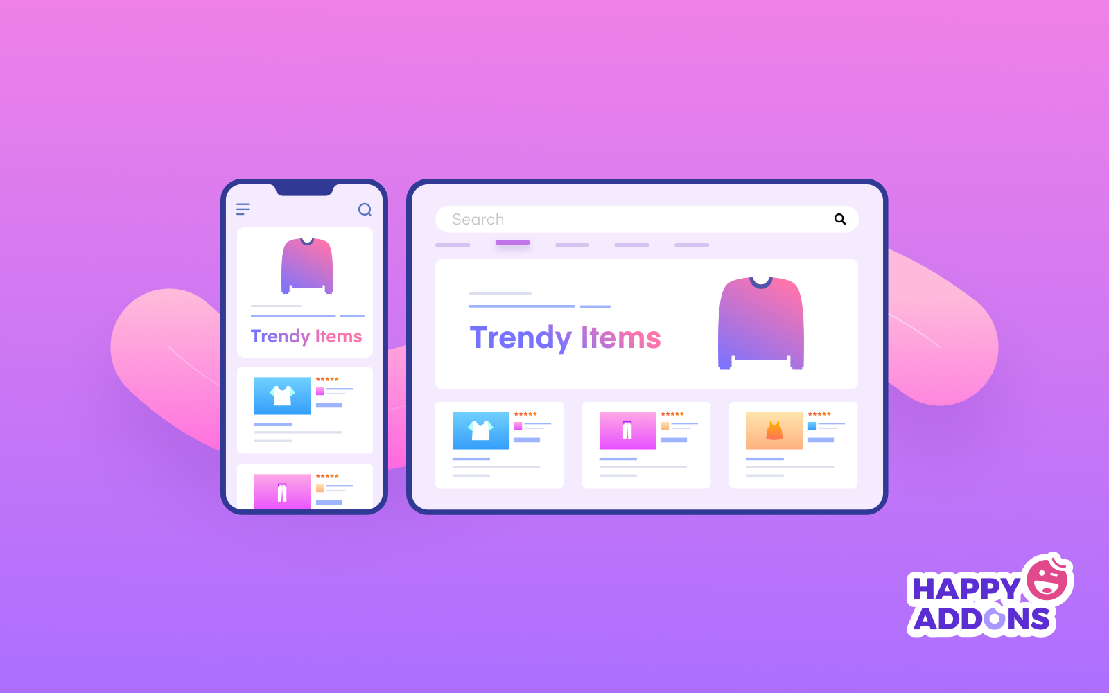
Top 10 Tips for Designing a User-Friendly Mobile Web Experience
Designing a user-friendly mobile web experience is crucial in today's digital landscape, where users rely on their smartphones for a variety of tasks. Here are the top 10 tips you should consider:
- Responsive Design: Ensure that your site adapts seamlessly to various screen sizes to provide an optimal viewing experience.
- Fast Loading Times: Optimize images and reduce HTTP requests to enhance loading speed, as users are often impatient.
- Intuitive Navigation: Use clear labels and a logical hierarchy to make navigation easy for users, preventing frustration.
- Clear Call-to-Action: Make your CTAs prominent and actionable, guiding users toward the next steps.
- Readable Text: Choose legible fonts and appropriate sizes to enhance the readability of your content on mobile devices.
- Touch-Friendly Elements: Design buttons and links that are easy to tap without zooming in.
- Consistent Branding: Maintain visual consistency to reinforce your brand identity across different devices.
- Minimalist Design: Embrace a clean layout that avoids clutter, allowing users to focus on the essential aspects of your content.
- User-Friendly Forms: Simplify forms by minimizing fields and using auto-fill where possible to streamline user input.
- Test Regularly: Continuously test your mobile site on various devices and browsers to identify any usability issues.
How to Optimize Your Mobile Site for Seamless Navigation
In today's digital landscape, mobile optimization is crucial for providing users with a seamless browsing experience. Optimizing your mobile site involves various strategies aimed at enhancing navigation, ensuring that visitors can easily find the information they need without any hassle. One effective approach is to implement a responsive design that automatically adjusts to different screen sizes. This means utilizing media queries and flexible grid layouts to create an interface that is both user-friendly and visually appealing on smartphones and tablets.
Another key aspect of seamless navigation is the optimization of menus and buttons. Ensure that your touch targets are large enough to be easily tapped, improving usability for users with larger fingers. Incorporate a sticky navigation bar that remains visible as users scroll down the page, which allows for quick access to important sections of your site. Don't forget to simplify your content layout by limiting text and using appropriate headings to guide users intuitively through your site.
Common Mobile Web Mistakes to Avoid for an Improved User Experience
When designing a mobile website, avoiding common mistakes can significantly enhance user experience. One major pitfall is neglecting responsive design. A website that doesn't adjust to various screen sizes can frustrate users, leading to higher bounce rates. Additionally, ensure that your navigation is intuitive; using oversized buttons or hard-to-read text can deter visitors. Consider implementing techniques such as thumb-friendly buttons and easily accessible menus to streamline navigation.
Another critical mistake is failing to optimize page load times. Users expect quick access to content, and slow-loading sites can drastically diminish engagement. Use tools to compress images and eliminate unnecessary scripts that may hinder speed. It's also essential to minimize interstitials; excessive pop-ups can annoy users and lead to abandonment. By addressing these issues, you will create a more satisfying mobile web experience that encourages return visits.