Veve Vortex: Exploring the Latest Trends
Stay updated with the latest in news, tech, and lifestyle.
Typography Tricks That Will Elevate Your Website
Unlock the secrets of stunning typography! Discover tricks to elevate your website and captivate your audience instantly.
5 Essential Typography Tips to Enhance Your Website's Aesthetic
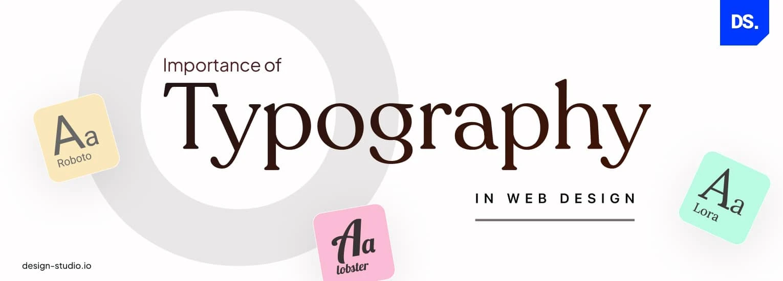
Typography plays a crucial role in defining your website's aesthetic and enhancing user experience. The right choice of fonts not only affects readability but also sets the tone for your brand. Start by selecting a web-safe font that reflects your brand personality. It's essential to limit the number of different fonts to two or three to maintain consistency and coherence throughout your pages. Incorporate ample white space between headings and body text to create visual hierarchy, making it easier for visitors to scan your content.
Furthermore, pay attention to font size and line height to enhance readability, particularly on mobile devices. A general guideline is to use a minimum font size of 16 pixels for body text and adjust line height to about 1.5 times the font size for comfortable reading. Experiment with typographic hierarchy to guide users through your content, using styles like bold or italic sparingly to draw attention to key points. Finally, ensure sufficient color contrast between text and background for accessibility purposes, aligning with the principles outlined by the Web Content Accessibility Guidelines.

How Font Choices Influence User Experience on Your Website
The choice of font on your website plays a crucial role in shaping user experience. Different fonts convey varying emotions and can significantly affect how your content is perceived. For instance, using a sans-serif font may create a modern and clean aesthetic, suitable for tech-savvy audiences, while a serif font can evoke a sense of tradition and trust, often used by law firms or financial institutions. Furthermore, legibility is paramount; a font that is hard to read can drive users away, leading to higher bounce rates and lower engagement.
Moreover, font choices also impact website accessibility. A font that is easy to read on various devices improves the overall user experience, making your content more approachable. It's essential to consider factors such as font size, line spacing, and contrast against the background. By prioritizing legibility and choosing the right font, you not only enhance aesthetic appeal but also ensure your website is user-friendly for a broader audience, thus improving your site's SEO and attracting more visitors.
The Importance of Hierarchy: Creating Visual Order with Typography
Typography plays a crucial role in establishing visual hierarchy, which guides readers through your content seamlessly. By manipulating various typographic elements such as font size, weight, color, and spacing, designers can create a structured flow that prioritizes information. For instance, larger headings grab attention and signal the main idea, while smaller text provides supplementary details. As noted by Smashing Magazine, an effective typographic hierarchy not only enhances readability but also aids in navigation, making it easier for users to comprehend and engage with the content.
Moreover, the significance of visual order cannot be overstated when crafting content that resonates with users. A well-defined hierarchy allows content creators to emphasize important points, drawing the reader's eye to key messages. According to HubSpot, utilizing contrasting typography effectively can evoke emotions and establish a compelling narrative. By applying these principles, businesses can improve user experience, reduce bounce rates, and ultimately boost their SEO performance, as a structured layout tends to retain audience attention longer.